Add Butter Smooth Scroll-triggered Animations to your Static Website
As a frontend developer, reveal animations are a simple but effective way to include delight in your end user’s experience. It is a method of having content appear just-in-time as they scroll through your website — and with control over the entry animation, you’re able to pull off some nifty and fluid transitions between different sections.
In this post, I will teach you how to add some simple reveal animations to your website, specifically with NextJS, Framer Motion and Styled Components.
You can just as easily follow along this tutorial without using styled-components. Though, I highly recommend it — it is my favourite way of writing re-usable CSS components.
What we’re building
At the end of this tutorial, you should be equipped with everything you need to add your own scroll-triggered reveal animations to your next project. Heck, you can even spruce up some of your existing websites! We will be exploring some of the basics techniques of the Framer Motion library to build our own simple website.
Intended audience
This tutorial is best suited for developers with beginner to intermediate knowledge of React, who are looking to improve the look and feel of their websites.
Framer Motion
Framer Motion is an animation library for React that feels like magic. It allows developers to easily add enter and exit animations, and animations based on some state for just about any css property. It’s API is well written and well documented with tons of examples.

Since v5.3, they have introduced a whileInView prop that allows you to perform animations based on an element’s visibility in the viewport — also known as scroll-triggered animations. With this, you’re able to easily pull of transitions that would have previously required you to use some combination of react-intersection-observer and useState.
Getting Started
I have created a boilerplate repo for us to get started. Create your own fork of the andelh/framer-motion-reveal repo. It is a NextJS app with a few standard text and image elements added for us to animate. Feel free to check out the final branch to see what we will be achieving at the end.
The repo includes the following notable dependencies:
- framer-motion
- styled-components
Okay now that we’re all set, let’s get started!
It all starts with a Hero
Our first section to tackle is the Hero Section. It contains just two text elements:
Title- an h1 elementCopy- a paragraph element
We will add a simple entry animation to this section since these elements are seen as soon as you land on the page.
To begin, turn both of the styled components into motion elements. Framer extends every HTML and SVG element with their own motion component. They work exactly like their standard counterparts but allow you to access framer’s powerful Motion API.
When using styled-components, we can achieve this like so:
  // Standard styled elements
  const Title = styled.h1`
    font-size: 60px;
    font-weight: bold;
  `
  const Copy = styled.p`
    margin-bottom: 25vh;
  `
  // Framer motion styled elements
  const Title = styled(motion.h1)`
    font-size: 60px;
    font-weight: bold;
  `
  const Copy = styled(motion.p)`
    margin-bottom: 25vh;
  `
When using HTML, you can just convert the tag to one of Framer’s replacement elements like so:
  <!--Standard HTML elements-->
  <h1>A Superb and Extended Title</h1>
  <p>Some copy</p>

  <!--Framer Elements-->
  <motion.h1>A Superb and Extended Title</motion.h1>
  <motion.p>Some copy</motion.p>
Animating the text

Now let’s add our first animation. With framer, we can do this using just the animate prop. Together, initial, animate and transition will be your bread and butter for most animations.
initial- describes the animations state that the component should be in when it mounts. Any CSS property can be passed into this object such asopacityandbackgroundColor.animate- describes to animation state that we want to transition to. By default, the from part of the animation is described in theinitialprop. from the initial. We can also use state values here to trigger different animation states.transition- helps us describe how we wish to present our animation, with options for the duration, delay, easing and more.
With this in mind, let’s animate our components!
<Title
initial={{ opacity: 0, y: 50 }}
animate={{ opacity: 1, y: 0 }}
>
A Superb and Extended Title
</Title>
<Copy
initial={{ opacity: 0, y: 50 }}
animate={{ opacity: 1, y: 0 }}
>
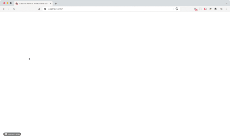
The most powerful MacBook Pro ever is here. With the blazing-fast M1
Pro or M1 Max chip — the first Apple silicon designed for pros — you
get groundbreaking performance and amazing battery life. Add to that a
stunning Liquid Retina XDR display, the best camera and audio ever in
a Mac notebook, and all the ports you need. The first notebook of its
kind, this MacBook Pro is a beast.
</Copy>
This is nice, but we can make it better. Using the transition prop, let’s adjust the duration and delay so that the text elements appear one after the other.
  <Title
    initial={{ opacity: 0, y: 50 }}
    animate={{ opacity: 1, y: 0 }}
    transition={{
      duration: 1.5,
      delay: 0.4,
    }}
  >
    A Superb and Extended Title
  </Title>
  <Copy
    initial={{ opacity: 0, y: 50 }}
    animate={{ opacity: 1, y: 0 }}
    transition={{
      duration: 1.5,
      delay: 0.7,
    }}
  >
    The most powerful MacBook Pro ever is here. With the blazing-fast M1
    Pro or M1 Max chip — the first Apple silicon designed for pros — you
    get groundbreaking performance and amazing battery life. Add to that a
    stunning Liquid Retina XDR display, the best camera and audio ever in
    a Mac notebook, and all the ports you need. The first notebook of its
    kind, this MacBook Pro is a beast.
  </Copy>
Easings.net is a handy website for previewing different easing values to apply to your animation. Find one you like and add it to the transition prop in an array:
  <Title
    initial={{ opacity: 0, y: 50 }}
    animate={{ opacity: 1, y: 0 }}
    transition={{
      duration: 1.5,
      delay: 0.4,
      ease: [0.34, 1.56, 0.64, 1]
    }}
  >
    A Superb and Extended Title
  </Title>
  <Copy
    initial={{ opacity: 0, y: 50 }}
    animate={{ opacity: 1, y: 0 }}
    transition={{
      duration: 1.5,
      delay: 0.7,
      ease: [0.34, 1.56, 0.64, 1]
    }}
  >
    The most powerful MacBook Pro ever is here. With the blazing-fast M1
    Pro or M1 Max chip — the first Apple silicon designed for pros — you
    get groundbreaking performance and amazing battery life. Add to that a
    stunning Liquid Retina XDR display, the best camera and audio ever in
    a Mac notebook, and all the ports you need. The first notebook of its
    kind, this MacBook Pro is a beast.
  </Copy>
Looking good chap! Let’s move on to the next section
The Gallery Section
First things first, we’ll convert everything in the section to motion elements. You should be a pro at this by now 😉.
With this done, we can add our animations. Let’s re-use the Title animation properties from above for our Heading element.
This time though, we will have some fun and utilize Framer’s whileInView prop. Switch out the animate prop for whileInView and now, the animation happens only when the element is in view! Scroll around the page a few times to give it a try.
  <Heading
    initial={{ opacity: 0, y: 50 }}
    whileInView={{ opacity: 1, y: 0 }}
    viewport={{
      once: false,
      amount: "all",
    }}
    transition={{
      duration: 1.5,
      delay: 0.4,
      ease: [0.34, 1.56, 0.64, 1],
    }}
  >
    Here is a simple gallery reveal
  </Heading>
The viewport prop
With the whileInView prop applied, you gain access to the viewport prop which lets you adjust a few things about how your animation interacts with the...viewport (duh).
Here are a few key props:
once : Boolean
If true, the animation described will happen every single time the element comes into view
margin: string
A margin to add to the viewport when detecting whether the element has entered it. Useful for delaying the triggering of a viewport animation until more of the element is shown. A single value can be used to add a margin on every side, e.g. "200px". Or, multiple values can be defined to assign a margin to each axis in the order of top/right/bottom/left, e.g. "0px -20px 0px 100px".
amount: "some" | "all" | number
Defaults to "some", this option defines the amount of the element that has to intersect with the viewport in order for it to be considered within view. When using a number, 0 represents none and 1 represents all of the element.
Animating the images
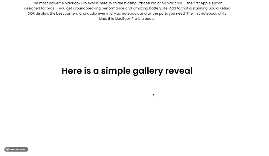
To your motion.img element, apply the following animation settings. It’s similar to what we’ve been using before, but here we use a scale up animation for the reveal instead. It helps to give the effect of the images popping into view. Here you can play around with the once and amount props to see which results you prefer!
  //...
  <Gallery>
    {images.map((image, index) => (
      <Image
        initial={{ opacity: 0, scale: 0.9 }}
        whileInView={{ opacity: 1, scale: 1 }}
        viewport={{
          once: false,
          amount: 0.9,
        }}
        transition={{
          duration: 1.5,
          delay: 0.4,
          ease: [0.34, 1.56, 0.64, 1],
        }}
        src={`https://picsum.photos/seed/{index}/230`}
      />
    ))}
</Gallery>
...
The List Section
For our list reveal, we want each item to gradually appear one after the other. To do this, we will set up something known as variants in Framer. You can think of variants as a way of describing different animation states in an object, so that you can refer to them in your JSX later on. They also allow you to "create animations that propagate throughout the DOM, and orchestrate them in a declarative way."
Before we get started, make sure you’ve converted all the elements in this section to motion components. You can apply the same Heading animation from above to the Heading in this section (and even consider making this its own reusable component, we’ve repeated it enough times!)
Next, we’ll create a variant object for the List Container and each List Item.
const list = {
  visible: {
    opacity: 1,
    transition: {
      staggerChildren: 0.2,
    },
  },
  hidden: { opacity: 0 },
};
const item = {
  visible: {
    opacity: 1,
    y: 0,
    transition: {
      duration: 0.7
    }
  },
  hidden: {
    opacity: 0,
    y: 40,
    transition: {
      duration: 0.7
      }
    },
};
We’ve described two animation states on our objects: hidden and visible. We can load this object into the motion component using the variants prop. Once they are applied, they can then be referred to by label inside of the initial and animate props.
  <List
    initial="hidden"
    viewport={{
      amount: "some",
    }}
    whileInView="visible"
    variants={list}
  >
    {listItems.map((listItem, index) => (
      <Item
        key={index}
        variants={item}
        viewport={{
          amount: "some",
        }}
        whileInView="visible"
        initial="hidden"
      >
        A simple list item {listItem}
      </Item>
    ))}
  </List>
The emoji spin
For our last section, we will use the whileInView and transition props to describe an animation that happens whenever the element is visible — and then plays on loop.
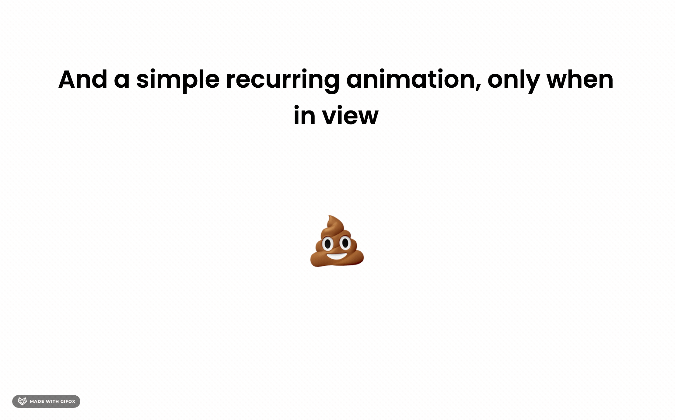
  <Emoji
    whileInView={{
      rotate: 360,
      opacity: 1,
    }}
    transition={{
      repeat: Infinity,
      repeatType: "mirror",
      duration: 2,
    }}
  >
    <span role="emoji">💩</span>
  </Emoji>
Closing the curtain
And that’s it! We’ve now built and seen how easy scroll-triggered animations are to implement with the Framer Motion library. Explore the different animations you can create by playing around with easing values, transitions and orchestration. Feel free to share your own forks of the project with me :)